Biblioteksgatan

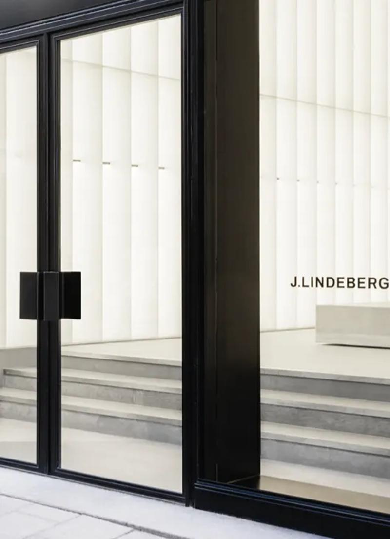
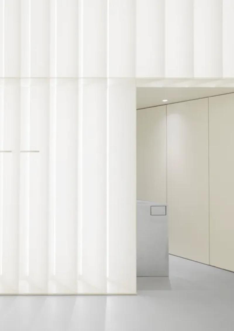
Biblioteksgatan is the kind of street where every storefront matters. It's Stockholm's version of a fashion address — not flashy, but understood , and J.Lindeberg's flagship here had to speak to that context. The store occupies a ground-floor unit in a turn-of-the-century building, and the design starts with the facade: a restored stone surround cleaned back to its original pale limestone, framing a modern intervention of full-height bronze-tinted glass. You see the interior before you enter, which is deliberate. The store is meant to draw you in, not wall you off.
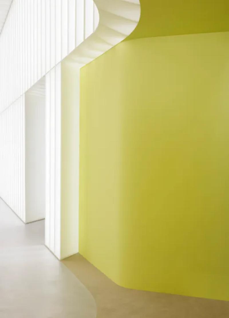
Inside, the space is organised around a long central table in honed Gotland limestone — a single slab, heavy and quietly dramatic , that serves as both a display surface and a gathering point. The fashion collection occupies the main room, hung on minimal wall-mounted rails in brushed stainless steel that almost disappear against the pale plaster walls. The sport and golf range sits in a secondary room to the rear, separated by a wide archway rather than a door, so the two collections feel connected but distinct. Underfoot, the flooring shifts from large-format concrete tiles in the main space to warm oak boards in the back room, a subtle signal that the mood is changing.
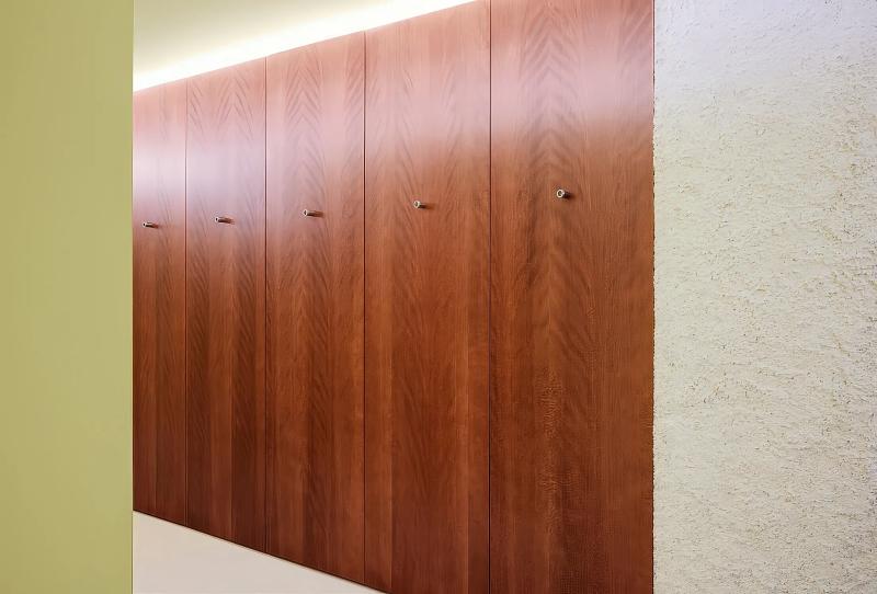
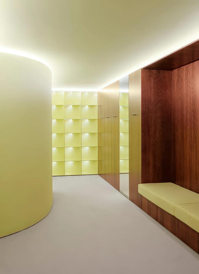
The details here are worth noticing. Fitting rooms with solid oak doors and leather pull handles. Recessed lighting in the ceiling that washes the walls evenly without creating harsh shadows on fabric. A small seating area near the entrance — a pair of upholstered benches in a muted olive wool , where someone can wait without feeling like they're in the way. The cash desk is set to one side rather than centred, wrapped in the same limestone as the central table, keeping the visual language consistent. What this store does well is balance: sport and fashion, heritage building and contemporary design, Swedish restraint and just enough warmth to make you want to stay. On a street full of carefully considered retail, it holds its own.
▪Location
Stockholm, Sweden
▪Sector
retail
▪Services
flagships, concept-store
▪Type
Biblioteksgatan
▪Surface
150 sqm
▪Project Manager
Tomai Nordgren
▪Palette
Base
#632A15
Secondary
#A99D84
Highlight
#EAE9E2
Accent
#B8B04A
Biblioteksgatan reads as compact but deliberate. In Biblioteksgatan, Stockholm, Sweden, the plan keeps circulation clear so the room can stay quiet even when it is active. Materials do most of the speaking: wide-plank oak, brushed stainless steel, and matte painted walls that keep reflections controlled. The project keeps the brief grounded in use: Biblioteksgatan is the kind of street where every storefront matters. It's Stockholm's version of a fashion address — no. The result is observational and precise. Nothing asks for attention, but everything is legible once you slow down.
The sequence feels edited rather than sparse. You move through Biblioteksgatan without friction, and each surface carries enough weight to hold the eye. Junctions are clean and repeatable, which gives the small shifts in material a stronger effect. The project keeps the brief grounded in use: Biblioteksgatan is the kind of street where every storefront matters. It's Stockholm's version of a fashion address — no. What stays with you is restraint. The project avoids gestures and leans on proportion, texture, and sequence instead.
At Biblioteksgatan , the layout works like a measured script. The room gives you one clear line of movement, then lets details accumulate at the edges. Junctions are clean and repeatable, which gives the small shifts in material a stronger effect. The project keeps the brief grounded in use: Biblioteksgatan is the kind of street where every storefront matters. It's Stockholm's version of a fashion address — no. It lands through control, not spectacle. Proportion and material contrast carry the atmosphere from one frame to the next.
▪Spatial Priorities
Circulation clarity
Movement routes are kept legible so browsing, service, and dwell zones do not compete.
Sightline control
Displays and focal points are arranged to maintain visibility while preserving rhythm through the space.
Lighting hierarchy
Ambient, focal, and task lighting are balanced so materials read correctly without flattening depth.
▪Material Notes
Key Materials
Material cues referenced in the project text: Oak, Limestone, Concrete, Stainless Steel, Glass, Plaster.
Color Reference
Image-derived palette baseline: Base #632A15, Secondary #A99D84, Highlight #EAE9E2, Accent #B8B04A. Use as a visual reference and validate against material samples on site.
Finish Notes
Keep finish notes practical: identify high-touch surfaces, wear-prone edges, and cleaning-sensitive materials.
▪Delivery Scope
Concept Development
Spatial concept, layout direction, and design intent framing.
Material & Finish Specification
Selection and documentation of key finishes, fixtures, and surfaces.
Art Direction
Visual consistency across touchpoints, detailing, and spatial expression.
Merchandising / Display Logic
Display zones and fixture priorities coordinated with circulation and visibility.
Related projects