Vogelenzang

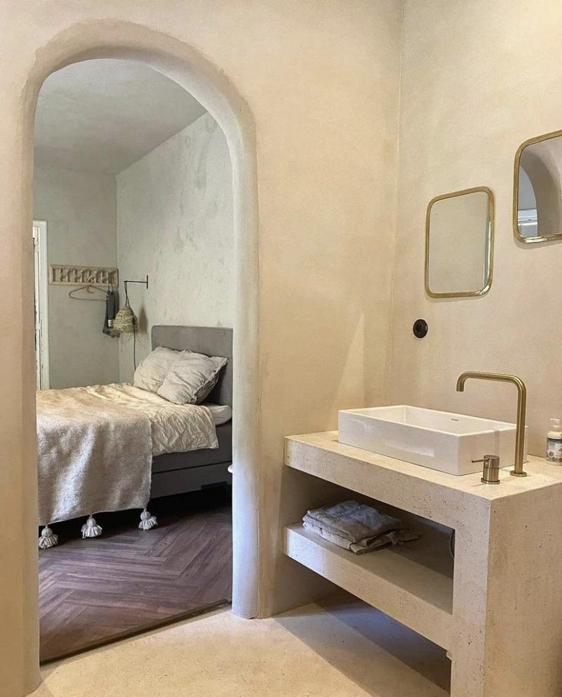
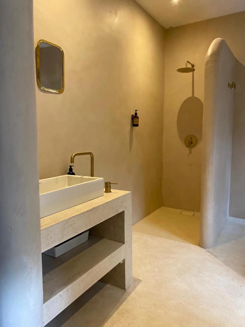
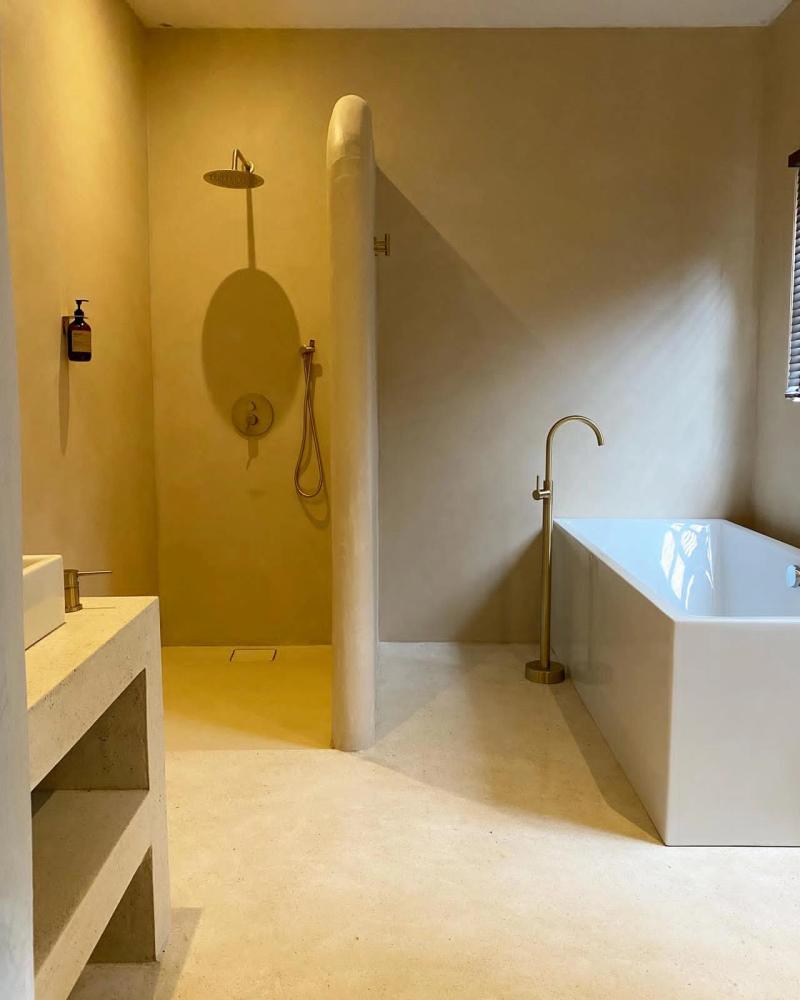
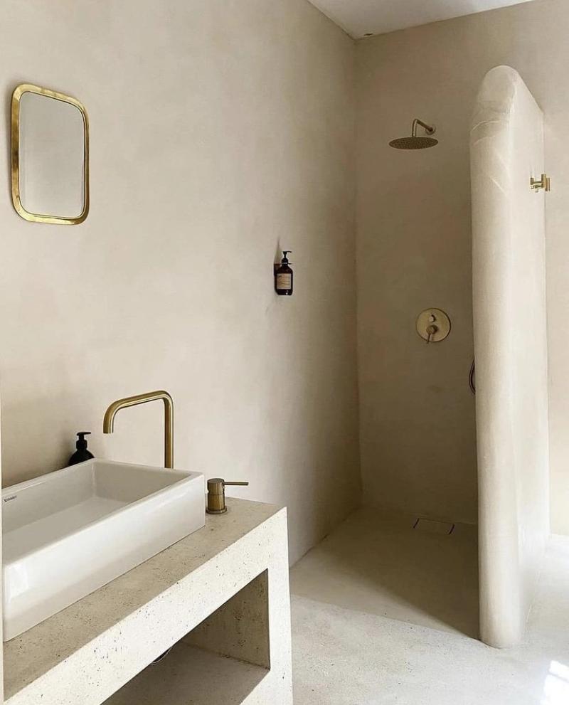
The bathroom is treated as a compact architecture rather than a utility room. Walls, floor, and vanity read as one continuous mass, with pale stone tones that reduce visual noise and make the room feel larger than its footprint. Geometry does most of the work, not decoration.
Hardware is sparse and deliberately placed. Brushed metal fittings, concealed storage, and diffuse ceiling light keep the composition quiet, while texture in plaster and stone adds depth up close. Each element is positioned for straightforward maintenance and daily use.
Water zones and dry zones are clearly separated without visual clutter. Subtle floor gradients, flush thresholds, and careful detailing around drainage keep the space practical while maintaining a calm, monolithic character.
Scale is controlled through consistent datum lines and concealed storage, so everyday objects stay out of view and the room keeps its architectural clarity over time.
▪Location
Vogelenzang, Netherlands
▪Sector
residential
▪Services
apartment-interior-design
▪Type
Vogelenzang
▪Palette
Base
#695231
Secondary
#AEA28F
Highlight
#D2C9BA
Accent
#857662
Vogelenzang reads as compact but deliberate. In Vogelenzang, Netherlands, the plan keeps circulation clear so the room can stay quiet even when it is active. Materials do most of the speaking: wide-plank oak, brushed stainless steel, and matte painted walls that keep reflections controlled. The project keeps the brief grounded in use: This bathroom is conceived as a sculpted sanctuary an architecture of calm surfaces and softened geometry where daily ri. The result is observational and precise. Nothing asks for attention, but everything is legible once you slow down.
The sequence feels edited rather than sparse. You move through Vogelenzang without friction, and each surface carries enough weight to hold the eye. Junctions are clean and repeatable, which gives the small shifts in material a stronger effect. The project keeps the brief grounded in use: This bathroom is conceived as a sculpted sanctuary an architecture of calm surfaces and softened geometry where daily ri. What stays with you is restraint. The project avoids gestures and leans on proportion, texture, and sequence instead.
At Vogelenzang, the layout works like a measured script. The room gives you one clear line of movement, then lets details accumulate at the edges. Junctions are clean and repeatable, which gives the small shifts in material a stronger effect. The project keeps the brief grounded in use: This bathroom is conceived as a sculpted sanctuary an architecture of calm surfaces and softened geometry where daily ri. It lands through control, not spectacle. Proportion and material contrast carry the atmosphere from one frame to the next.
▪Spatial Priorities
Circulation clarity
Movement routes are kept legible so browsing, service, and dwell zones do not compete.
Lighting hierarchy
Ambient, focal, and task lighting are balanced so materials read correctly without flattening depth.
Material readability
Surface changes are used to clarify zones, touchpoints, and pace rather than decorative effect.
▪Material Notes
Key Materials
Material cues referenced in the project text: Plaster, Stone.
Color Reference
Image-derived palette baseline: Base #695231, Secondary #AEA28F, Highlight #D2C9BA, Accent #857662. Use as a visual reference and validate against material samples on site.
Finish Notes
Keep finish notes practical: identify high-touch surfaces, wear-prone edges, and cleaning-sensitive materials.
▪Delivery Scope
Concept Development
Spatial concept, layout direction, and design intent framing.
Material & Finish Specification
Selection and documentation of key finishes, fixtures, and surfaces.
Art Direction
Visual consistency across touchpoints, detailing, and spatial expression.
Execution Support
Technical intent communicated for procurement, fabrication, and site coordination.
Related projects