Shoes Pop Up

At NK, the pop-up is built around one amplified gesture: a sneaker enlarged beyond product scale and treated as an object in space. The installation uses proportion as communication, making motion and performance legible from a distance. That single move gives the project a clear center of gravity without overcrowding the floor.
Supporting elements stay deliberately minimal. Neutral surfaces, focused lighting, and clear circulation keep attention on the central form while preserving comfortable customer flow. Smaller product displays are positioned to complement the main object rather than compete with it.
Material choices balance impact and durability. Painted structural elements handle wear, while higher-touch zones are resolved in tougher finishes that can survive constant interaction. Even as a short-term setup, the space behaves like a fully considered retail environment.
▪Location
Stockolm, Sweden
▪Sector
retail, experiential
▪Services
pop-up-store, brand-activation, exhibitions
▪Type
Shoes Pop Up
▪Palette
Base
#181814
Secondary
#7A7E72
Highlight
#B6B2A5
Accent
#363529
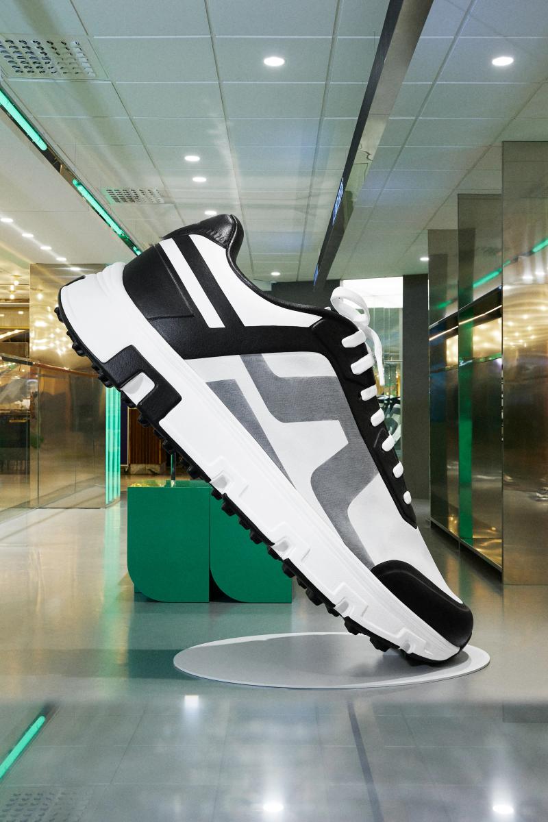
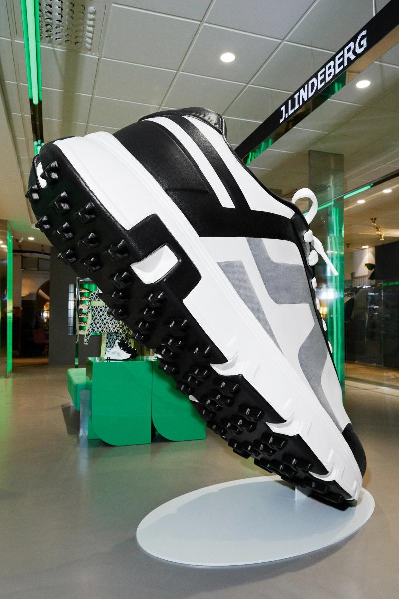
Shoes Pop Up reads as compact but deliberate. In Stockolm, Sweden, the plan keeps circulation clear so the room can stay quiet even when it is active. Materials do most of the speaking: wide-plank oak, brushed stainless steel, and matte painted walls that keep reflections controlled. The project keeps the brief grounded in use: In the heart of NK, performance becomes sculpture. A sneaker scaled to the unexpected engineered, amplified, and elevate. The result is observational and precise. Nothing asks for attention, but everything is legible once you slow down.
The sequence feels edited rather than sparse. You move through Shoes Pop Up without friction, and each surface carries enough weight to hold the eye. Junctions are clean and repeatable, which gives the small shifts in material a stronger effect. The project keeps the brief grounded in use: In the heart of NK, performance becomes sculpture. A sneaker scaled to the unexpected engineered, amplified, and elevate. What stays with you is restraint. The project avoids gestures and leans on proportion, texture, and sequence instead.
At Shoes Pop Up, the layout works like a measured script. The room gives you one clear line of movement, then lets details accumulate at the edges. Junctions are clean and repeatable, which gives the small shifts in material a stronger effect. The project keeps the brief grounded in use: In the heart of NK, performance becomes sculpture. A sneaker scaled to the unexpected engineered, amplified, and elevate. It lands through control, not spectacle. Proportion and material contrast carry the atmosphere from one frame to the next.
▪Spatial Priorities
Circulation clarity
Movement routes are kept legible so browsing, service, and dwell zones do not compete.
Sightline control
Displays and focal points are arranged to maintain visibility while preserving rhythm through the space.
Program flexibility
Spatial components are planned for quick resets, changing content, or temporary activation needs.
▪Material Notes
Key Materials
Material specification should be documented from drawing sets and site photography before final publishing.
Color Reference
Image-derived palette baseline: Base #181814, Secondary #7A7E72, Highlight #B6B2A5, Accent #363529. Use as a visual reference and validate against material samples on site.
Finish Notes
Keep finish notes practical: identify high-touch surfaces, wear-prone edges, and cleaning-sensitive materials.
▪Delivery Scope
Concept Development
Spatial concept, layout direction, and design intent framing.
Material & Finish Specification
Selection and documentation of key finishes, fixtures, and surfaces.
Art Direction
Visual consistency across touchpoints, detailing, and spatial expression.
Merchandising / Display Logic
Display zones and fixture priorities coordinated with circulation and visibility.
Related projects